Unemployment at 4.9%. More than 75 straight months of continuous job growth. Per capita GDP at an all-time high. Summer’s here. But nobody’s dancing in the streets.
Here are a couple graphs that may help explain why:
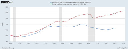
First, note that even as real per capita GDP continues to reach new peaks, the typical American adult (i.e., the person at the 50th percentile) in 2014 was no better off than in the last two recessions. Median personal income was down about 5% from about a decade ago. The rising tide is clearly not lifting all boats. The more politicians crow about the improving economy and the more economists say we are at “full employment,” the greater the disconnect becomes.
Caveat: Ideally I’d have median personal income data from after 2014. The numbers have likely improved since then. Jared Bernstein notes that real weekly earnings have grown almost 4% since 2014. Whether personal income has had similar growth also depends on employment trends. Which brings me to:
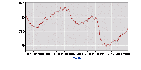
The above is the US “prime-age” (25-54) employment/population ratio from 1990 to present. The employment/population ratio is about 2 points lower now than then, partly because the standard unemployment rate is about 1 point higher and also because more jobless people are “out of the labor force,” i.e., not actively seeking work. Would they take work if offered it? The Bureau of Labor Statistics report for June suggests many of them would — the alternative unemployment rate including jobless “discouraged workers” and “persons marginally attached to the labor force” is 6.0%. (Add in part-time workers who’d prefer to be full-time and the rate rises to 9.6%. It’s been improving for six years but is still no better than in mid 2008 when we were in a recession.)
What’s really striking to me, and what inspired the title, is the gender breakdown of those prime-age employment/population numbers. (Sorry, the separate BLS graphs for men and women are too messy to use here, but you can Google them.) For women, the employment/population ratio has regained its 1990 level of 71%; for men, the ratio is down about 5 points, to 85%. There’s a story here, probably several. The erosion of male privilege has been a big theme of this year’s political commentary. Without getting into the politics or ethics of that, let’s just note:
- These graphs indicate that it by no means a new thing, at least in the labor market. The male employment/population ratio has been falling since 1969, when it was 95%. The female employment ratio has been rising steadily since at least the late 1940s, when it was less than half the current level.
- During the boom decade of the 1990s, the male employment/population ratio fell by about half a point, while the female ratio rose sharply, from 71% to 74.5%.
- Male employment was hit harder than female employment during the 2008-2009 recession (men’s employment fell from 89% to 81%, women’s from 74.5% to 69%).
- Men’s employment has actually risen faster than women’s during the post-2009 recovery (ratio up by about 4 points vs. 2 points), but again, the male employment ratio is down about 5 points from 1990, whereas the female employment ratio is unchanged.


